Creative Practice Begins Tatiana began building her creative practice through handmade design, custom packaging, visual concepts, and client-focused creative work.
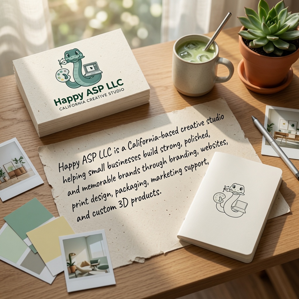
CALIFORNIA CREATIVE STUDIO
Where strategy, design, and production come together.
OUR PHILOSOPHY
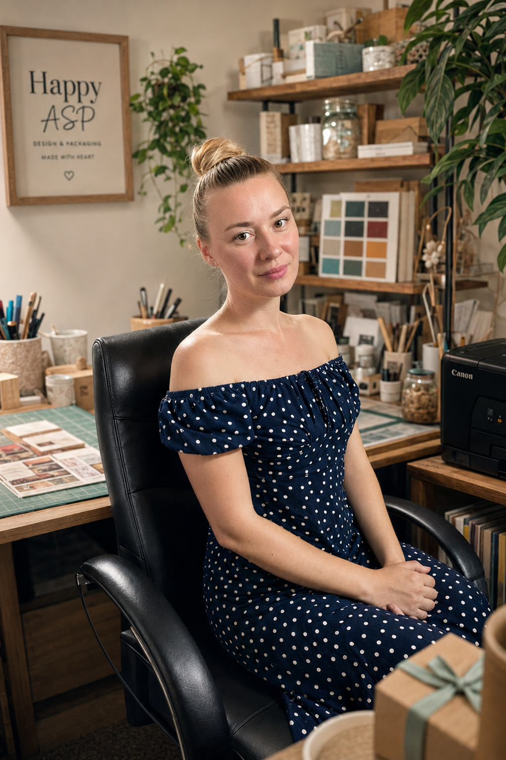
Founded and creatively directed by Tatiana Avdiushina, Happy ASP blends digital precision, hands-on production, and a trusted creative team. We believe strong brands should feel human, intentional, consistent, and ready for real business use.
CORE CAPABILITIES
Artisan Alley Community
A creative community initiative by Happy ASP supporting handmade makers through workshops, exhibitions, networking, events, and creative education.
Creative systems built for real businesses and creators.
Happy ASP combines branding, WordPress websites, print production, packaging, 3D products, and creative direction into complete visual systems for small businesses and creators.
SCROLL TO EXPLORE
What We Build
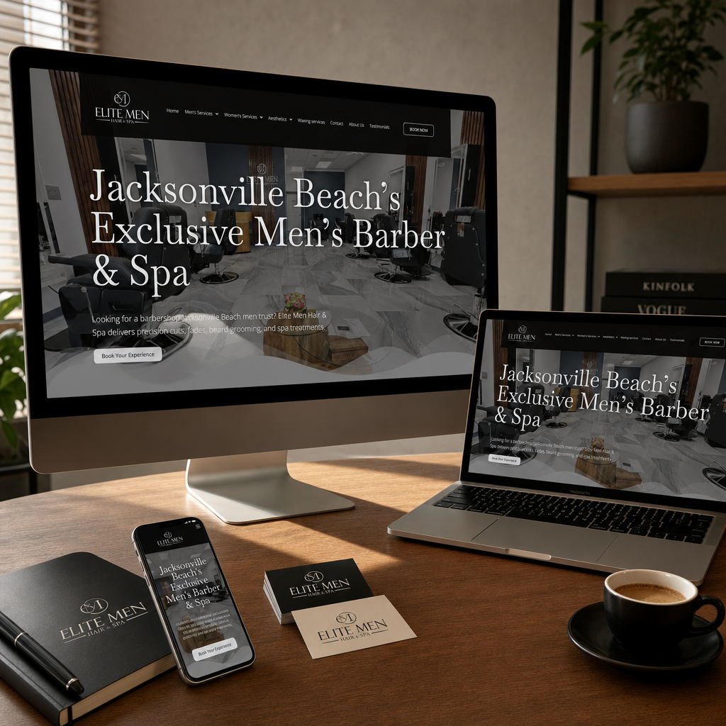
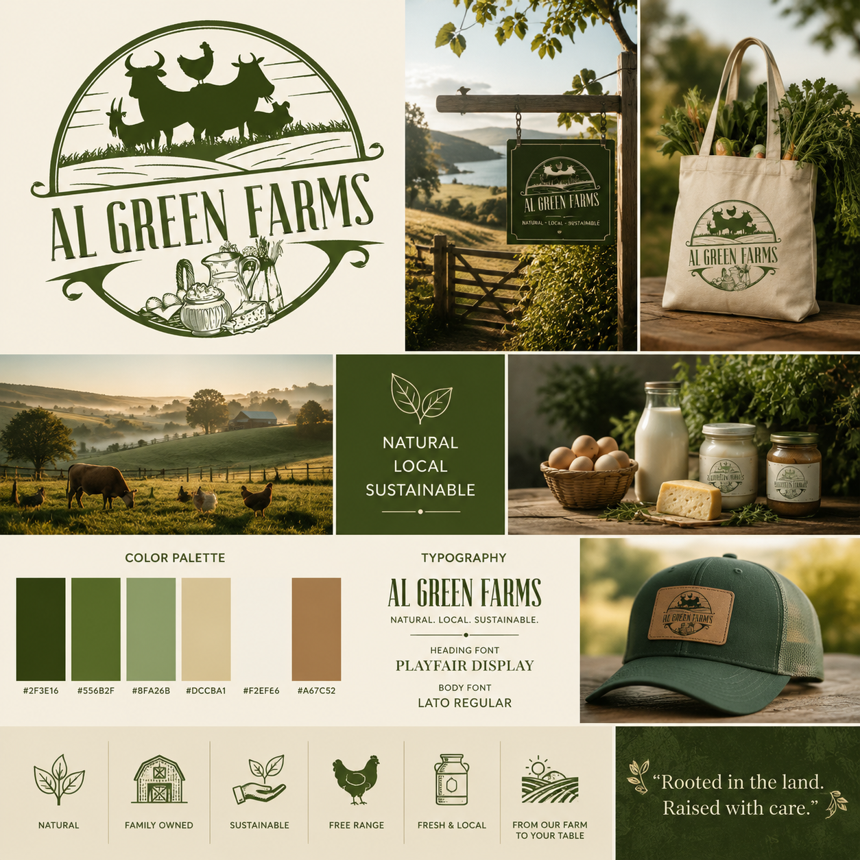
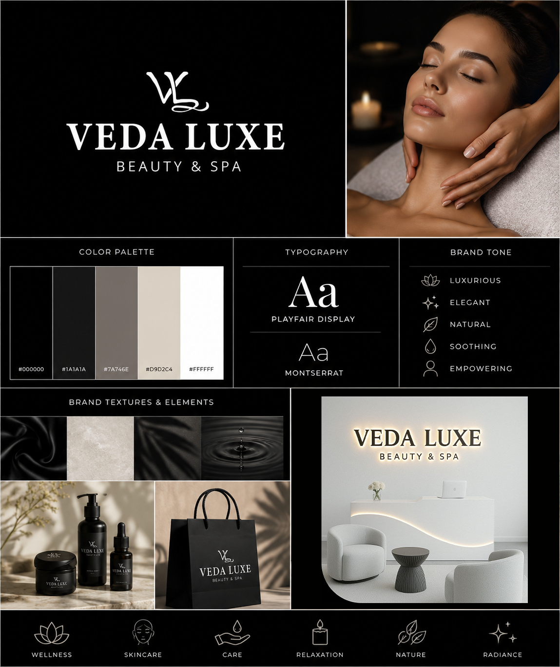
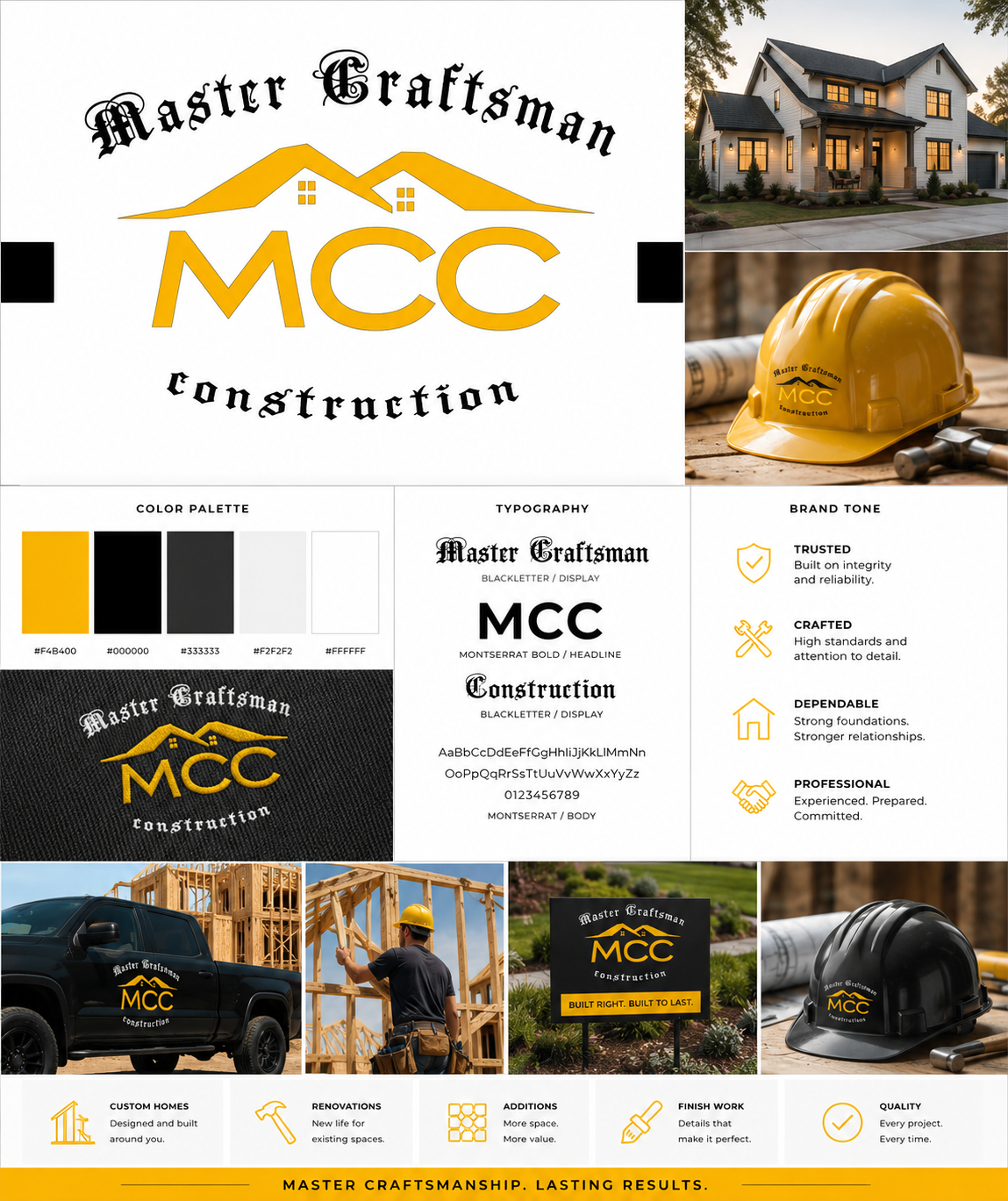
From brand identity and websites to print, packaging, 3D products, and marketing visuals, Happy ASP creates complete visual systems that help small businesses look professional, consistent, and ready to sell.
01
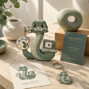
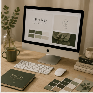
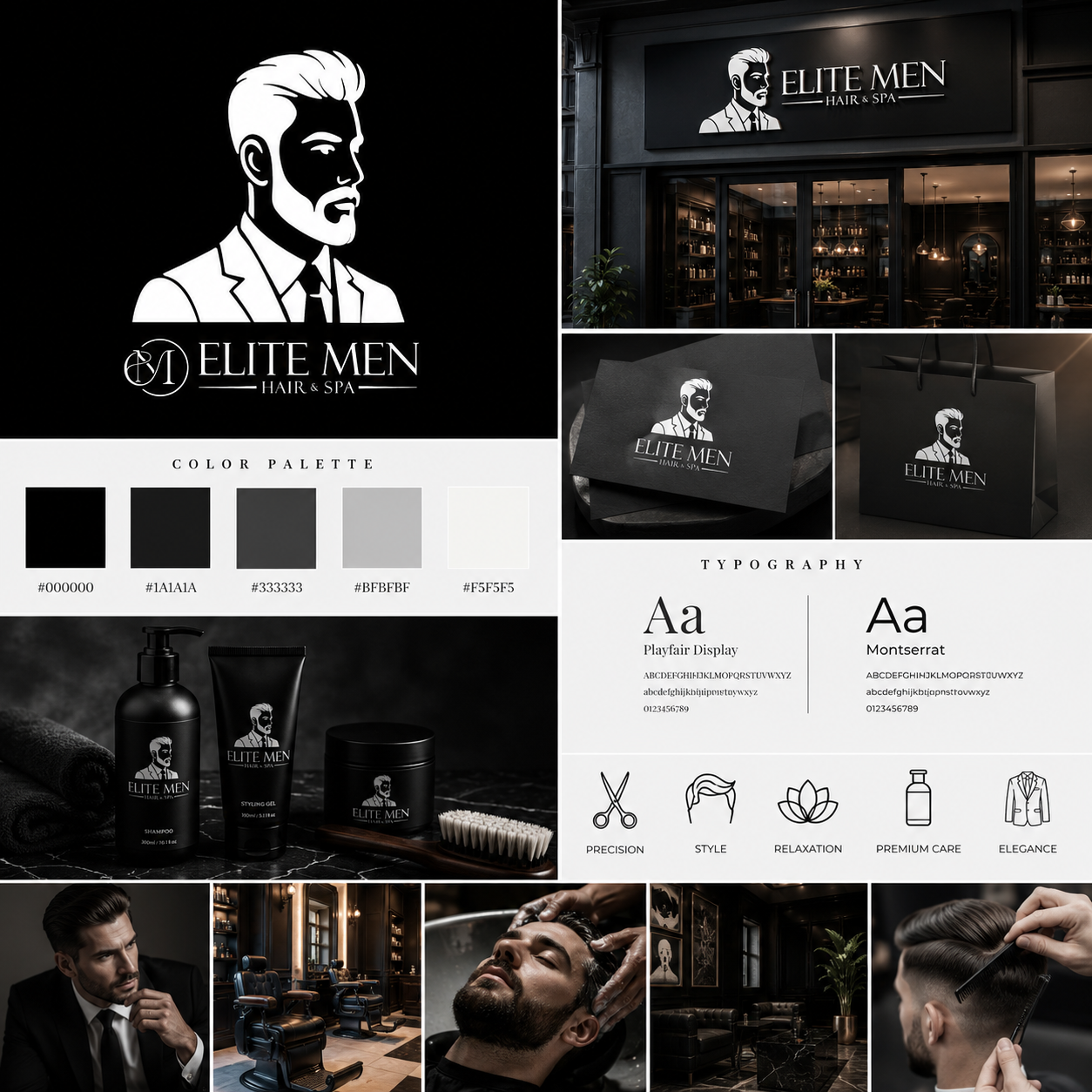
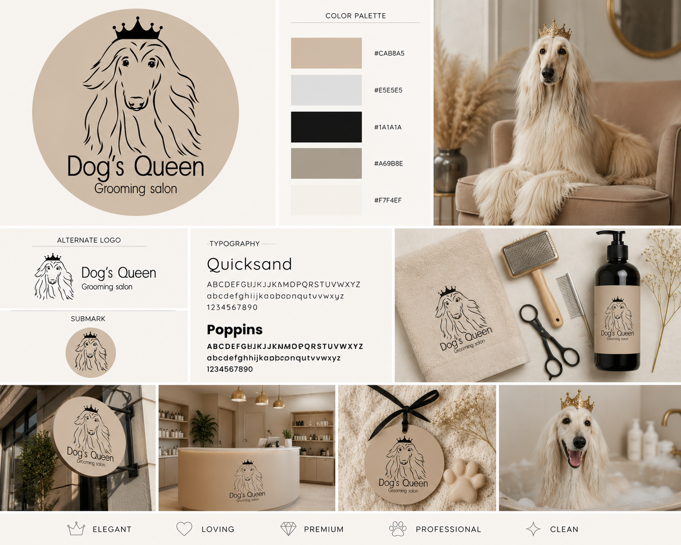
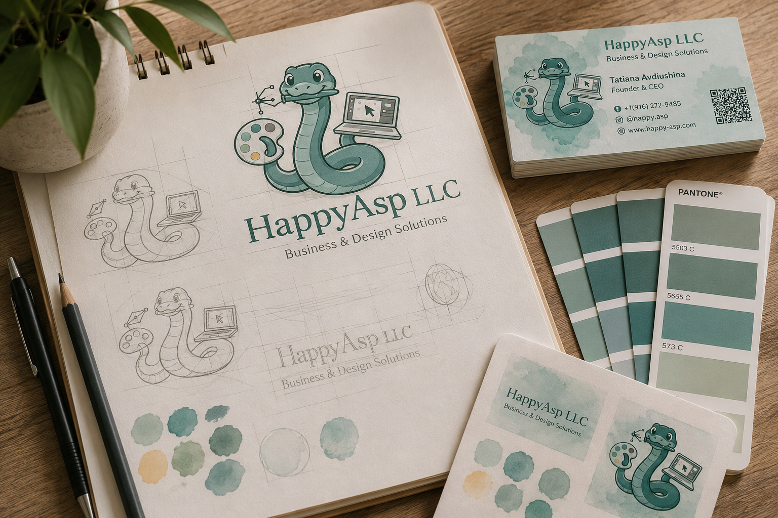
Branding & Identity
Logos, color palettes, typography, and visual direction that make your business feel recognizable, polished, and consistent across every platform.
02
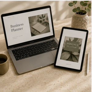
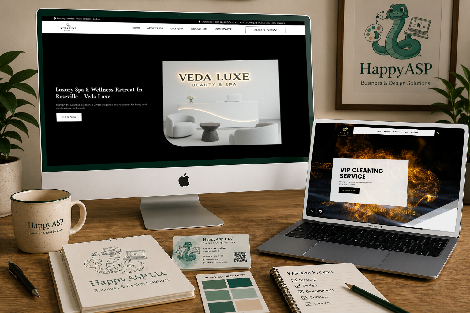
Websites & Online Stores
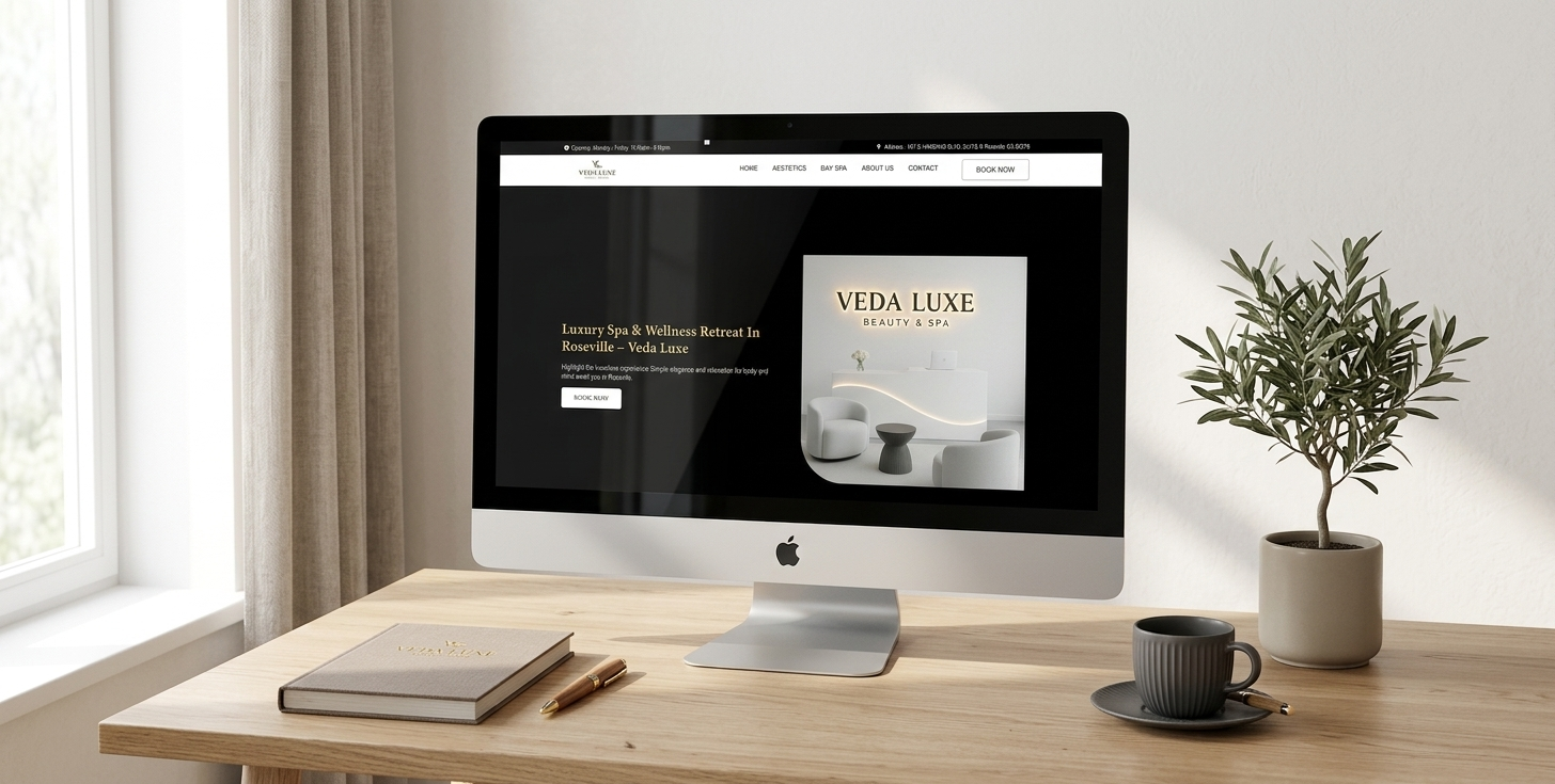
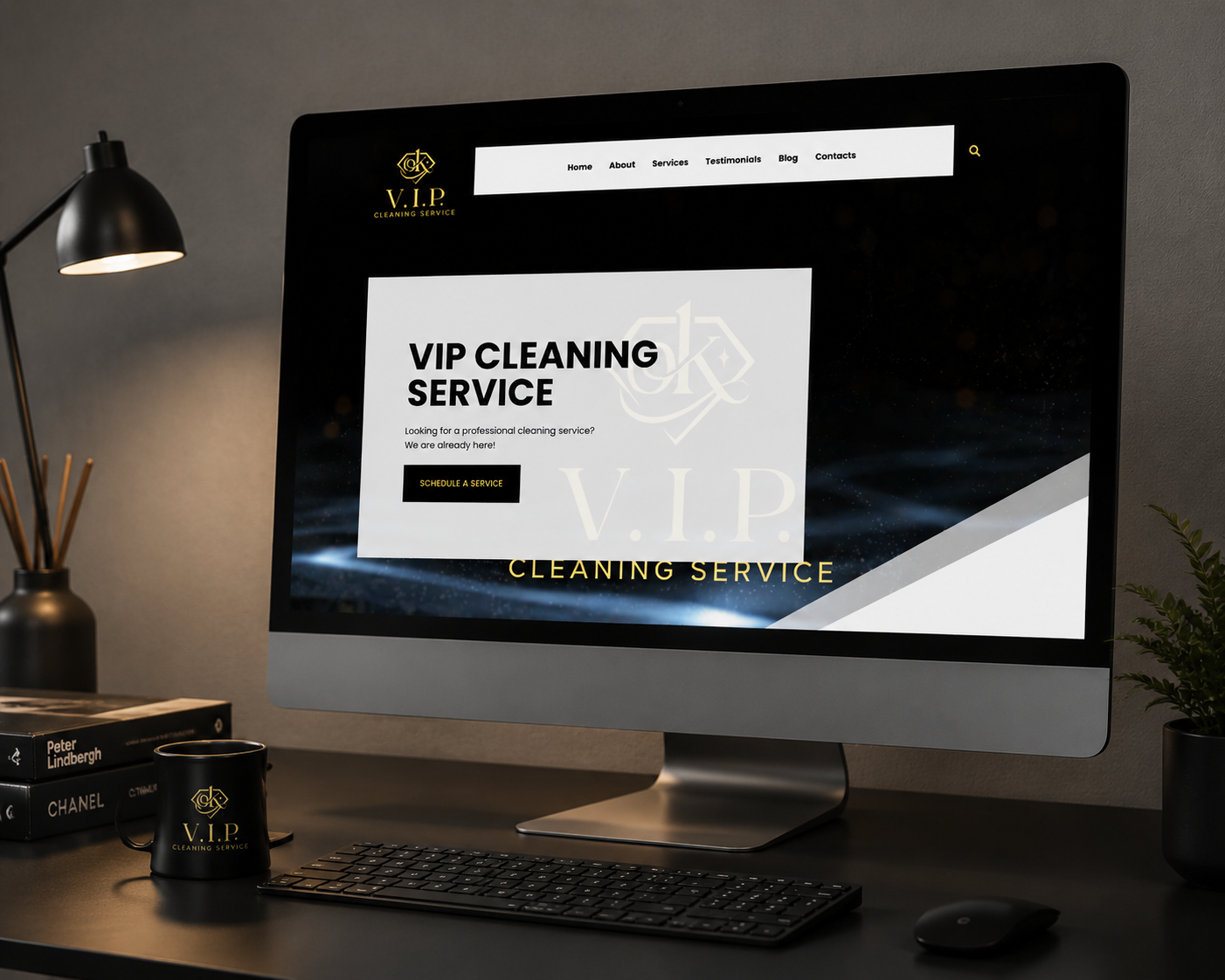
Custom WordPress websites, landing pages, service pages, and WooCommerce stores designed to look beautiful and help visitors become clients.
03
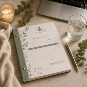
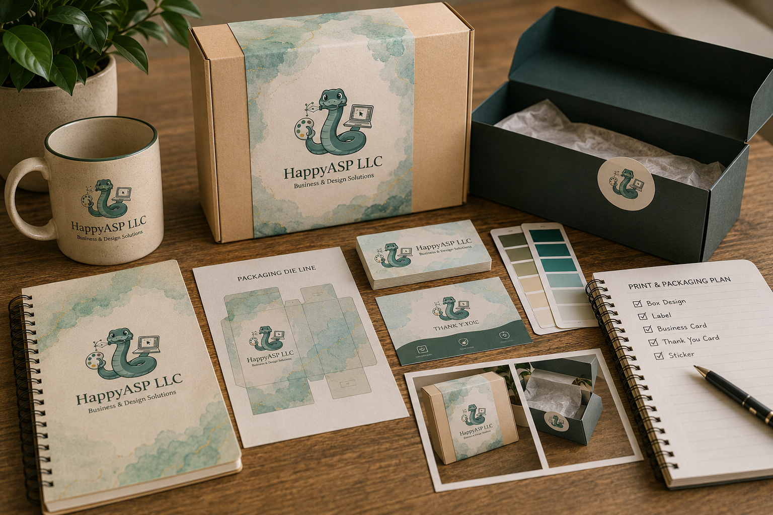
Print & Packaging
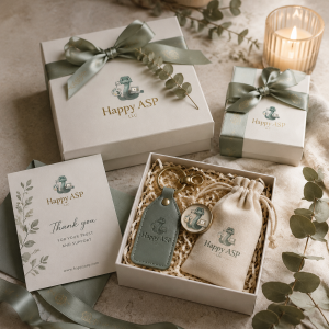
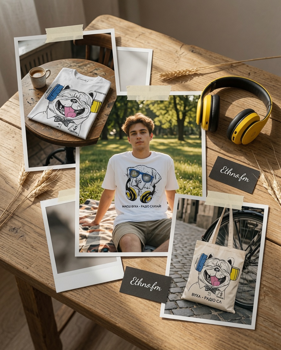
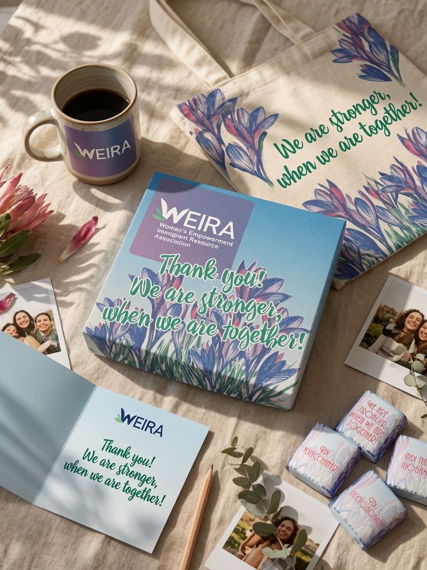
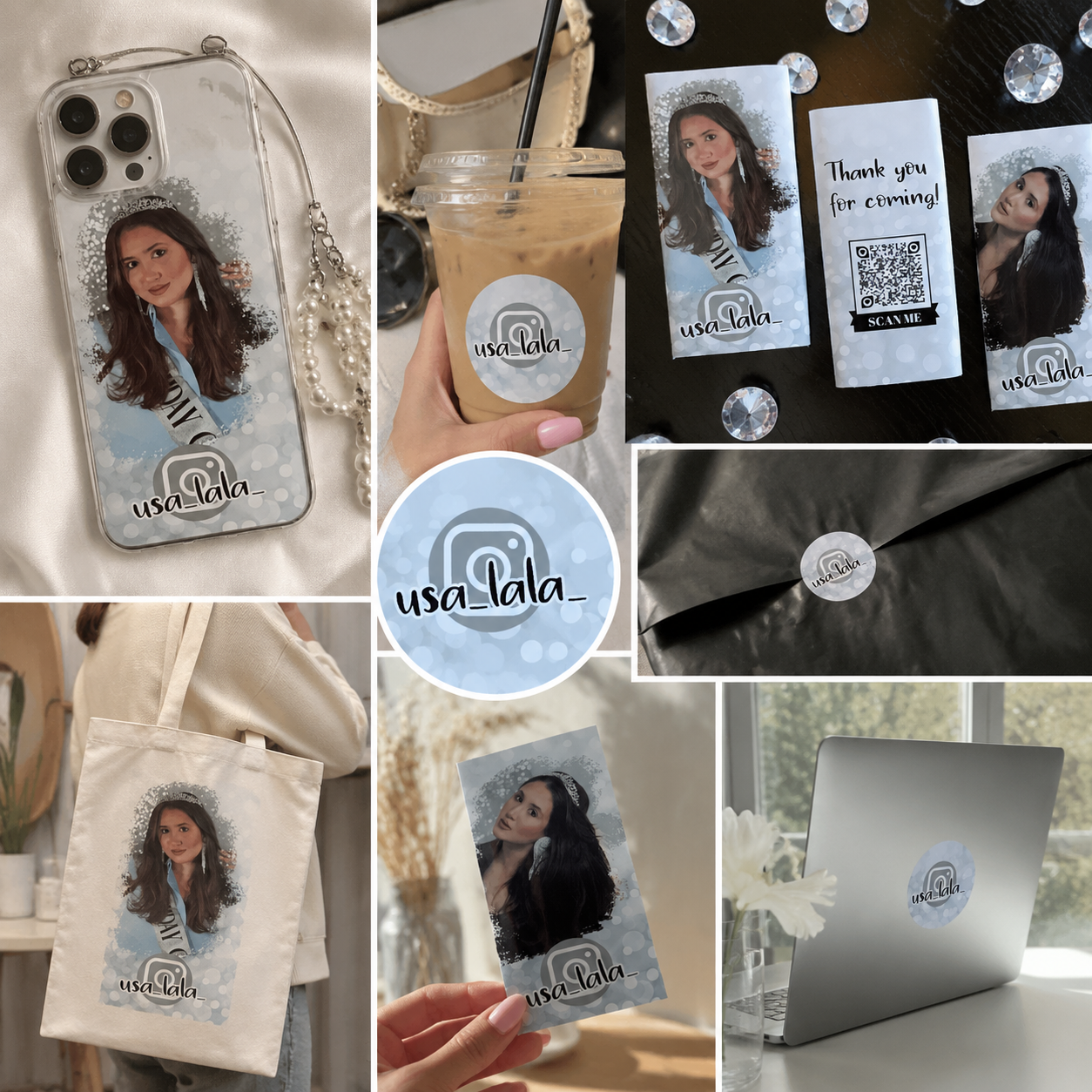
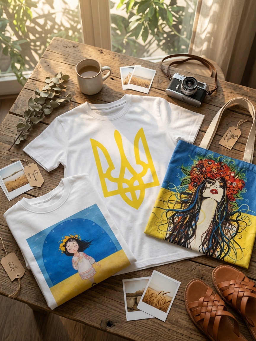
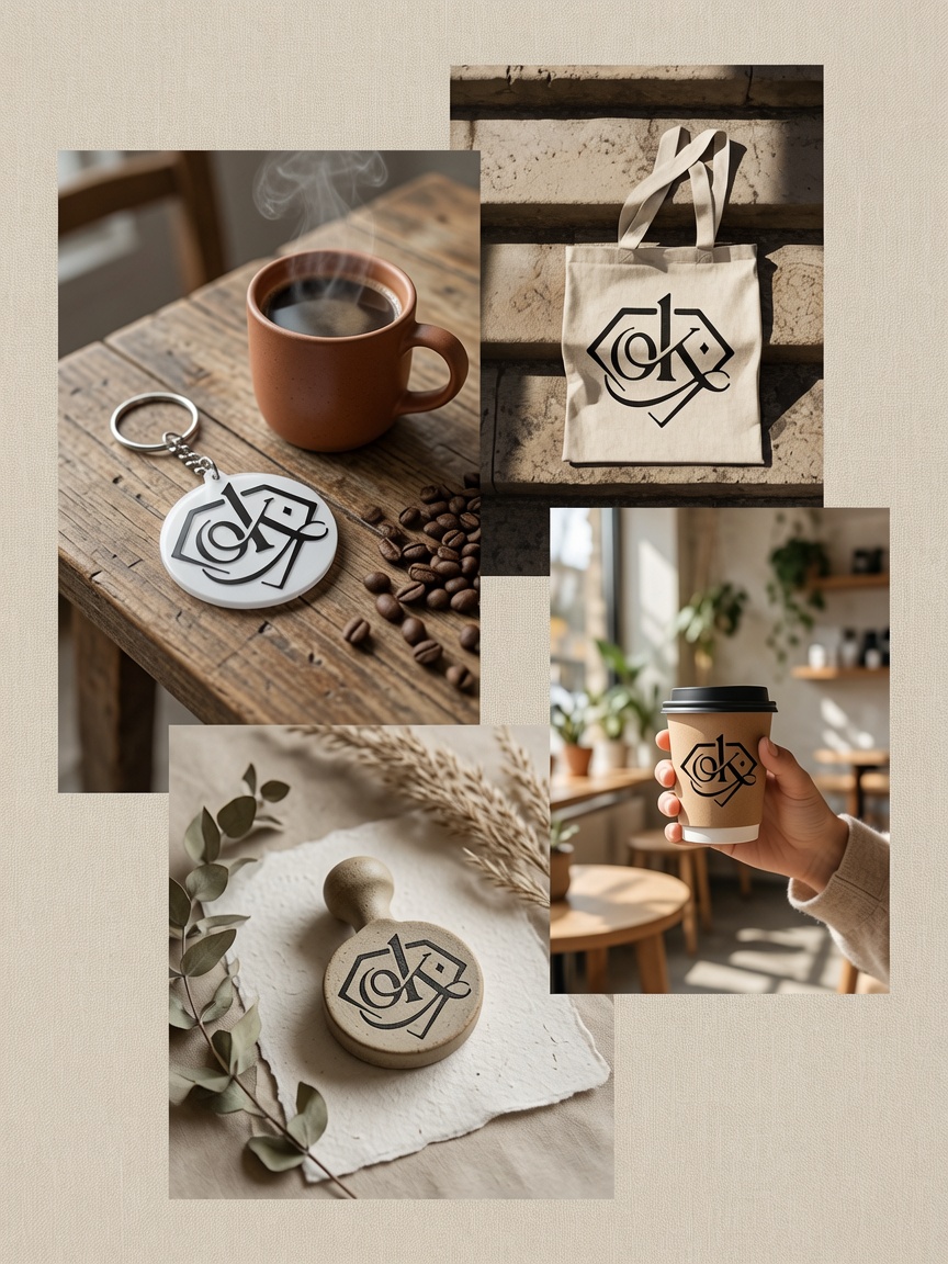
Business cards, flyers, labels, stickers, inserts, menus, gift cards, and packaging designed for real production and professional presentation.
04
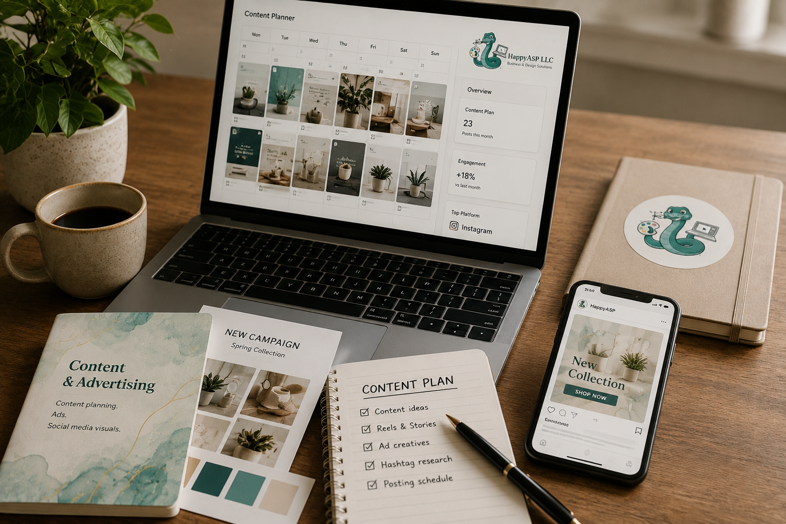
Content & Advertising
Social media visuals, ad creatives, content structure, Google Ads, Meta Ads, and promotional materials that help your business get noticed.
05
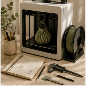
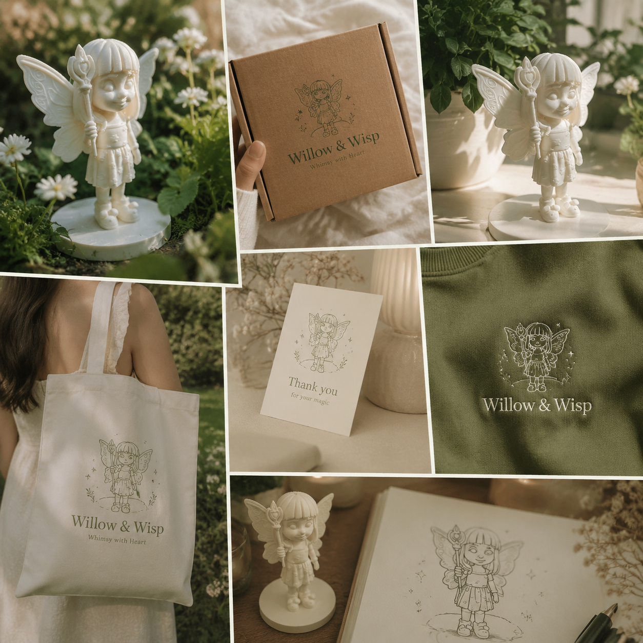
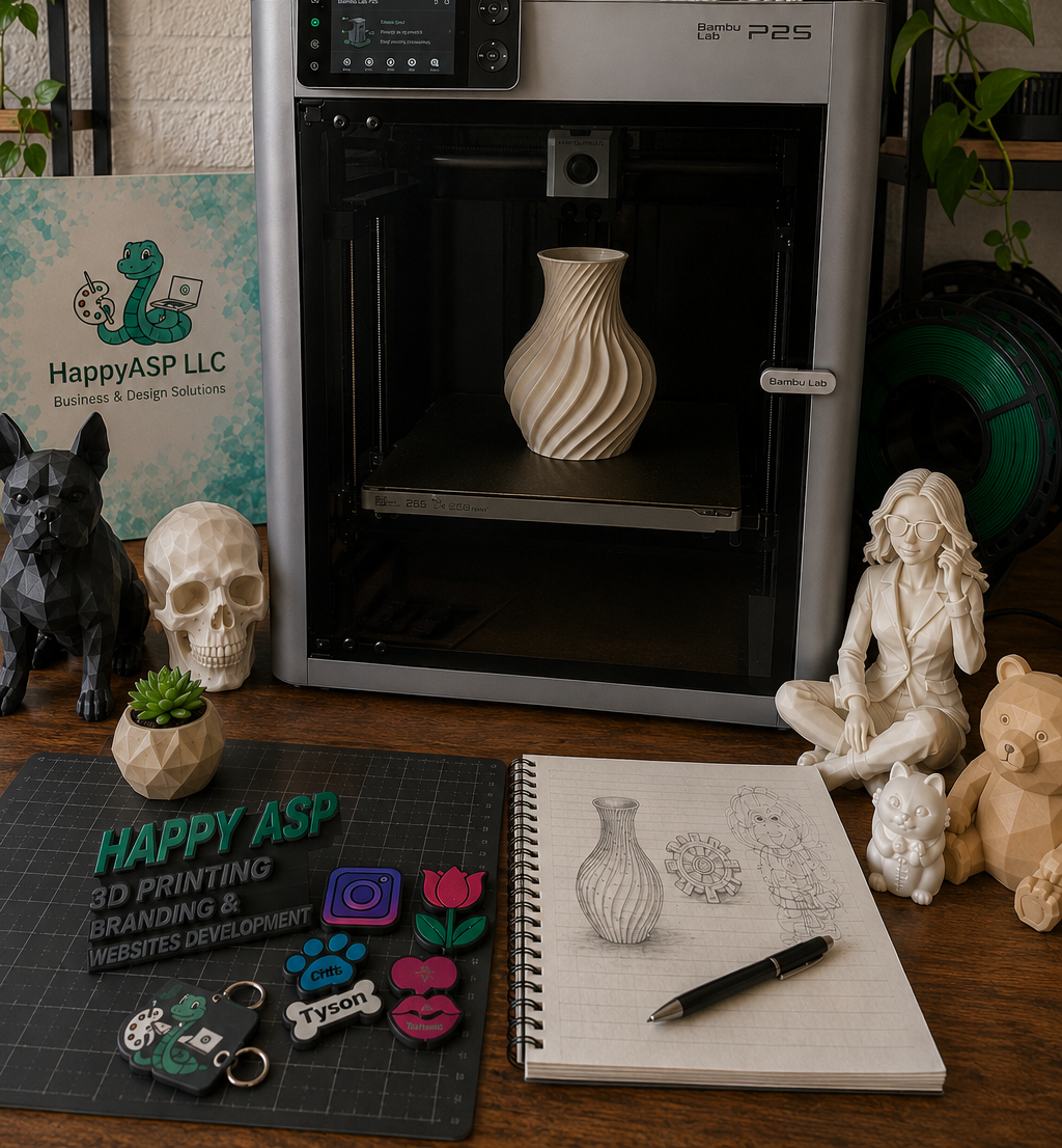
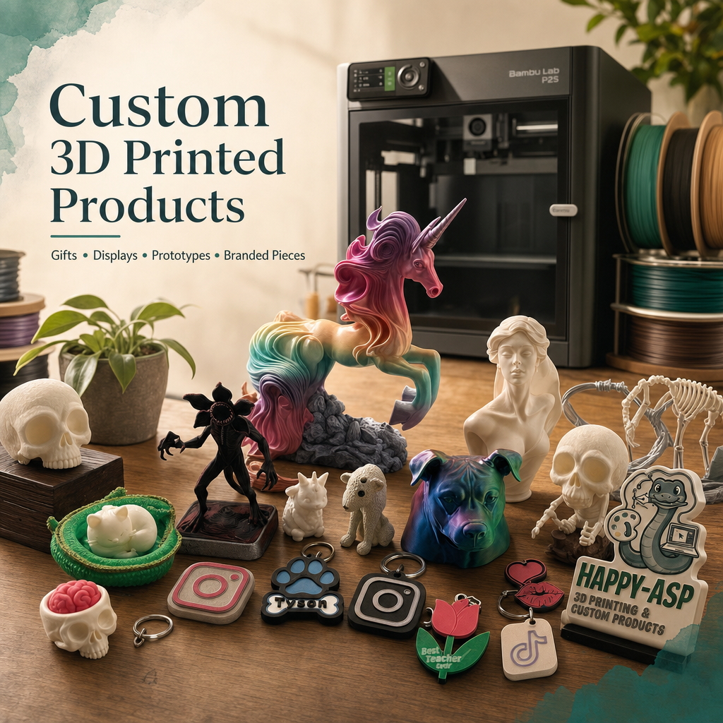
3D Printing & Custom Products
Custom 3D printed gifts, branded displays, prototypes, event pieces, and creative accessories made in small batches for real business use.
06
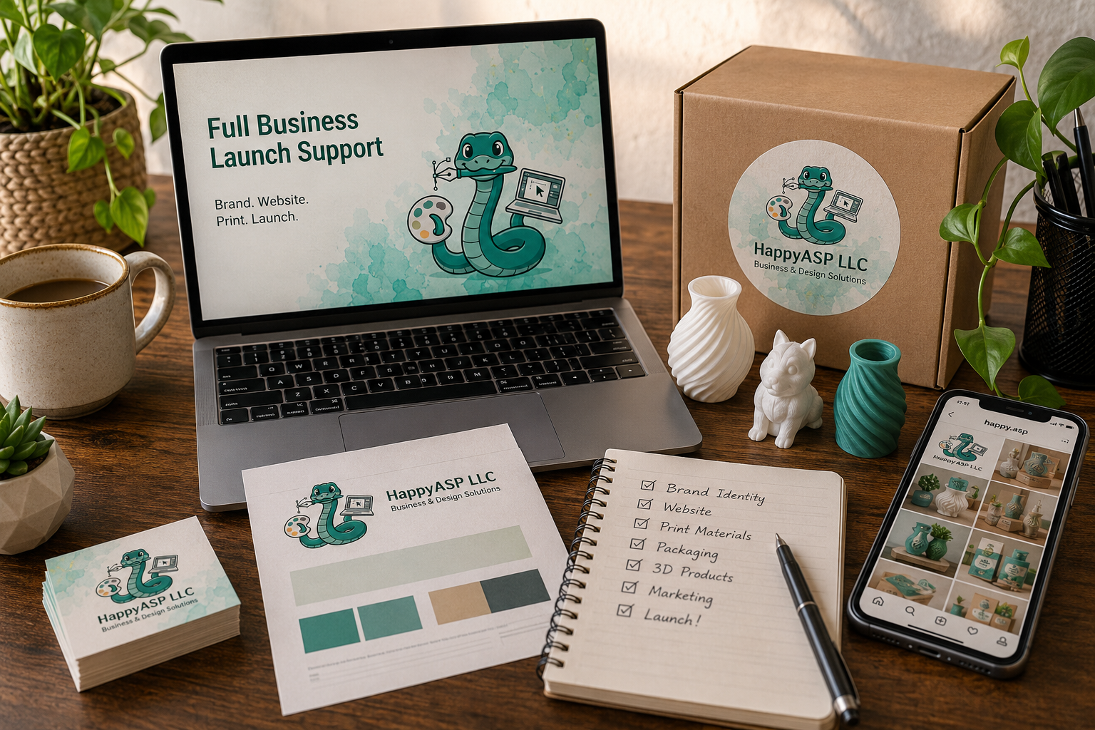
Full Business Launch Support
A complete creative setup for new or growing businesses: branding, website, print materials, packaging, content, and launch direction.
Built through real projects and creative production
Happy ASP is a California-based creative studio built through real client projects, hands-on production, and years of creative problem-solving.
We create complete visual systems for small businesses and creators, combining branding, websites, print materials, packaging, content, and 3D products.
Each project is guided by Tatiana’s creative direction and supported by a trusted creative team, so the final result feels polished, consistent, and ready for real business use.
Tatiana Avdiushina
Founder & Creative Director
Selected Work
A selection of real client work and in-house projects across websites, branding, print production, packaging, and 3D products.
How Projects Come to Life
A clear creative process that turns ideas into polished brands, websites, printed materials, packaging, and custom products.
CREATIVE SYSTEMS
Built for Long-Term Growth
Your brand should work beyond one logo, one website, or one printed piece. Happy ASP builds connected creative systems that help your business look consistent, professional, and ready to grow across digital design, print, packaging, content, and physical products.
Happy ASP Studio Shop
Creative goods, custom pieces, and small-batch products designed for real life, gifting, and business presentation.
Our Journey
CREATIVE COMMUNITY
Artisan Alley
A creative community initiative by Happy ASP, created to support handmade makers through workshops, exhibitions, events, networking, and creative education.
Trusted by Clients & Creators
Real reviews from businesses and creators who partnered with Happy ASP to bring their ideas, brands, and projects to life.
Frequently Asked Questions
Your brand should work beyond one logo, one website, or one printed piece. Happy ASP builds connected creative systems that help your business look consistent, professional, and ready to grow across digital design, print, packaging, content, and physical products.
Let’s Build Something Meaningful
Ready to bring your business idea to life? Happy ASP creates connected branding, websites, print materials, packaging, content, and 3D products designed to look professional, consistent, and ready to grow.
Journal
Insights, project notes, and creative process stories from the Happy ASP studio.